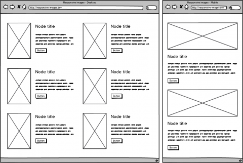
The days of fixed-width websites are long behind us, and with fluid widths came fluid images. In many cases, we don’t want to display an image of the same size on mobile devices and desktops, because we truly don't need a 2000px wide image on a 480px device. Or maybe we want to display a completely different image at some breakpoint.
For this we have the HTML5 <picture> element which can contain a multiple <source> elements with srcset and media attributes. The browsers choose the right source based on a media query.
In my case, I had to show a completely different image size on mobile devices vs. desktop.

There are two core modules in Drupal 8 that allow you to do exactly that.
The first one is Breakpoint. It manages breakpoints and breakpoint groups for responsive design and because it doesn't have a user interface you have to define these breakpoints in your theme.breakpoints.yml file (For more information about the Breakpoint module see the online documentation).
themename.mobile:
  label: mobile
  mediaQuery: ''
  weight: 0
  multipliers:
    - 1x
themename.desktop:
  label: desktop
  mediaQuery: 'all and (min-width: 1024px)'
  weight: 2
  multipliers:
    - 1x
The second module is Responsive Image. Make sure you enable it before you start as it's not enabled by default. This module provides an image formatter and breakpoint mappings to output responsive images using the HTML5 picture tag.
After you define the "normal" image styles for different breakpoints you can create a new Responsive image style and set the appropriate image styles for each breakpoint.

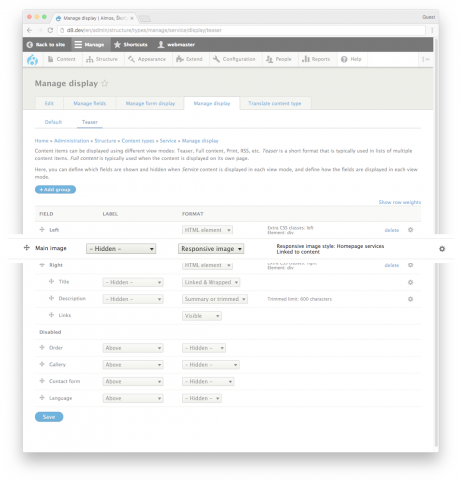
It's time for the last step. Select the Responsive image formatter for your field in "Manage Display" section of your content type and choose the newly created responsive image style.

To recap everything:
- create themename.breakpoints.yml
- enable responsive images
- configure normal image styles
- configure responsive image styles
- set responsive image formatter in display ct settings
And there you have it. An image that has been specifically sized for the screen has been successfully loaded.
Did you find this article useful?
Buy me a coffee.
Do you have a web development problem you cannot seem to be able to solve?
Send me an email or reach out to me on Twitter.
